In celebration of JKS Incorporated’s 40th anniversary, we’re taking you on a tour through the evolution of our logo.
The Early Days
Our very first logo was designed by JKS Incorporated’s Founder, Will Spencer, and his friend, Ken P. Ring. To understand the intention of the logo, you first need to know the history behind our name.
While brainstorming names for his new business, Will initially thought to use his own initials—WLS. This idea, however, was quickly discarded after Will realized there was a famous radio station based in Chicago that used the same call letters.
“It sounded too much like a radio station anyway,” said Will.
Ultimately, Will landed on “JKS,” borrowing the initials from his father, John Kerr Spencer. In developing his business Will says that John Kerr was a huge inspiration and that using “JKS” in his business’ name would be the ultimate way to honor him.
“It felt and sounded right,” said Will. “Plus, if the business hadn’t been successful, I could always just blame my dad.”
With a name locked in, Will and Ken took to the drawing board. The result was a red, white, and blue logo with horizontal lines that conveyed a strong sense of forward movement and paid homage to our working relationship with NASCAR.
“You can definitely see the early 1980s inspiration in the design,” says Christy Cox Spencer, JKS Incorporated’s President. “Will likes to say that the KFC franchise copied his idea. Their logo changed just a few years later and looked awfully familiar.”
Perhaps the company behind the Original Chicken Recipe isn’t so original after all!

JKS Motorsports, Inc.
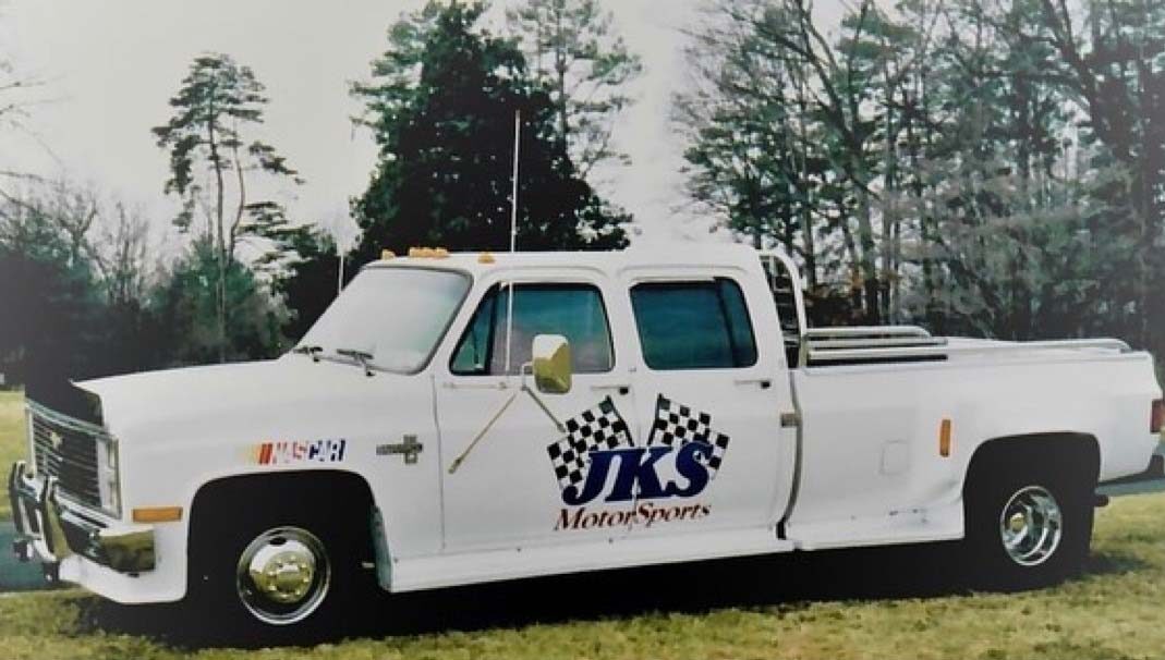
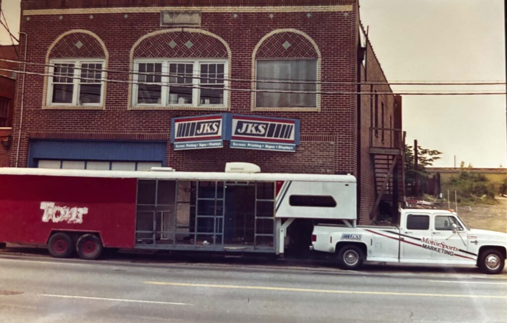
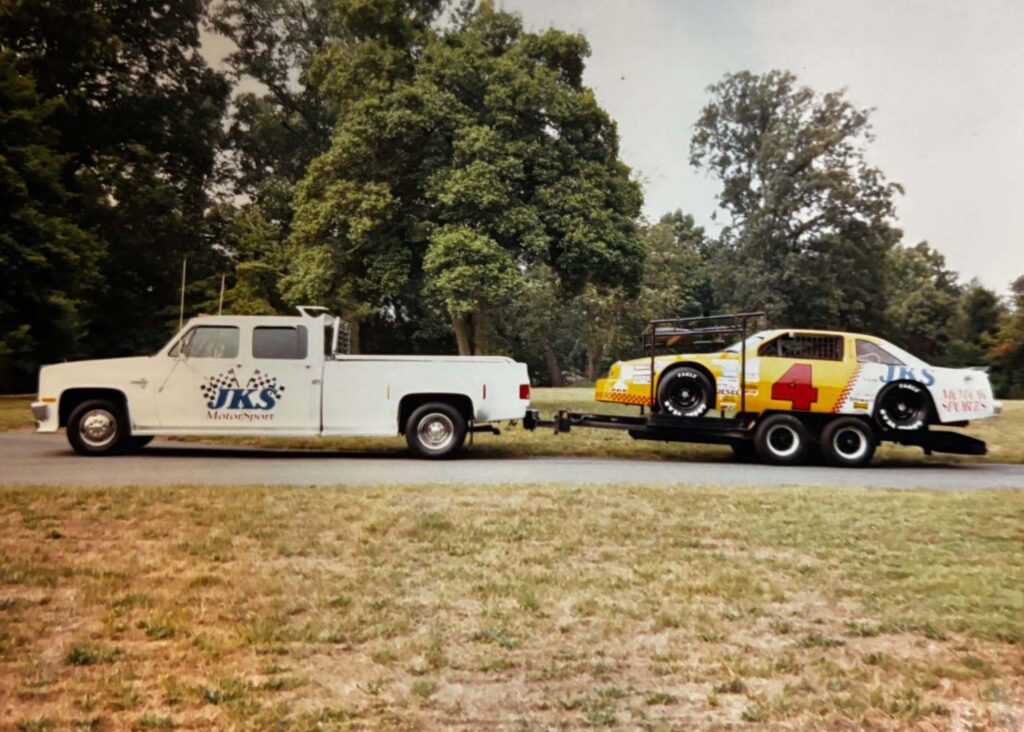
In the early days of JKS, Will created a secondary logo for the “Motorsports Marketing” division of the business. By 1991, this mark had morphed into the first iteration of the JKS Motorsports logo with the addition of two checkered flags.
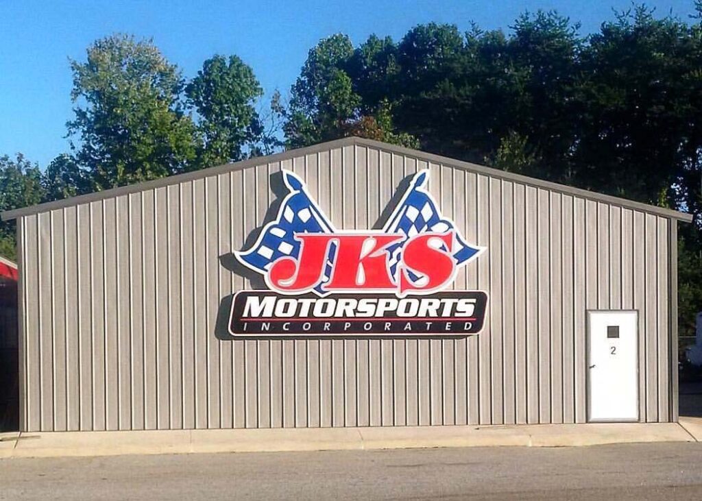
After JKS incorporated in the early 2000s, our logo underwent a third (but subtle) facelift. This version of the logo endured until 2016.
Today’s Logo
As our business continued to grow throughout the 2010s, we steadily began to diversify outside of the motorsports industry. As such, the name “JKS Motorsports, Inc.” didn’t feel true to form any more.
“By 2016, I felt strongly about removing the flags and the word ‘motorsports’ from our logo,” said Christy. “Our official name became ‘JKS Incorporated’ and I reached out to Rueben Rink here in Winston-Salem to start working on a new logo and icon that would more accurately represent the work we do.”
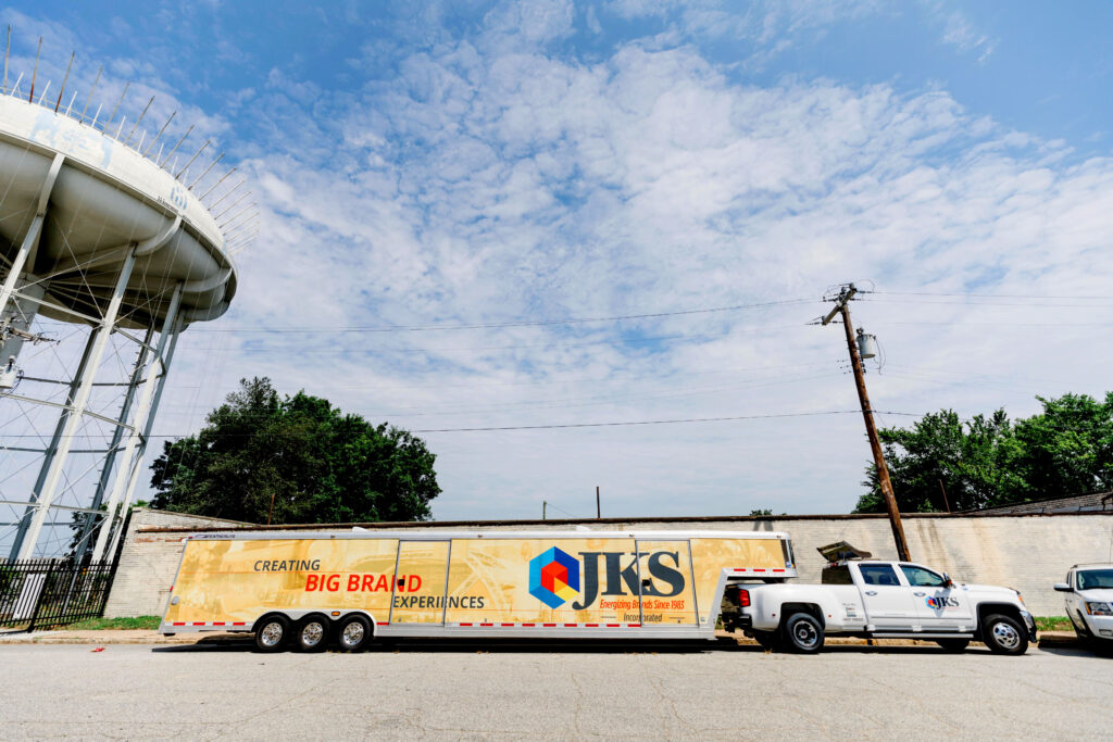
John Kerr Spencer’s initials are still the prominent feature of today’s logo, but now they sit next to a colorful hexagon that surrounds a box with an open door.
“The box represents a display in one sense,” said Christy. “This is really fitting given our expertise with experiential events and display building.”
As an added touch, the multiple colors inside the hexagon call to the various divisions and wide array of products and services we offer our clients.
“Our current logo is definitely my favorite,” said Christy. “Obviously, I am biased because I was involved in its creation from start to finish. This rebrand was a major learning curve for me, but I also loved the challenges it presented and all of the creativity and ideation that went into it.”
As this logo enters its eighth year in use, we are proud of the vision it represents and excited to see where it takes our company in the coming years.
![]()